cs/designsystem
Design Component Library
A new design system for Lukka platform experience
Role
As the Product Design Lead, I held a pivotal role in high-level design management. My responsibilities included defining the overall design project timeline, scope, and framework. Working closely with a dedicated senior designer, I played a key role in planning, guiding design effort, and setting up governance structures to ensure a cohesive and efficient design process across multiple products for both internal and external usages.
Team
2 Front End Engineers
1 Product Owner (me)
1 Product Design Lead (me)
1 Senior Product Designer
Company
Lukka Inc
Insights
The research comprises two components. Firstly, it involves unveiling the challenges encountered by front-end engineers across different books of business, focusing on the utilization of design components and pinpointing issues in the design handoff and implementation process. Secondly, it encompasses a comprehensive audit of existing components as a general assessment.
Conducted interviews with 15 front-end engineers from different books of business, focusing on their experiences with design components and handoff processes. Reviewed historical data on design handoffs and implementation across various business units:
Data Point
85%
of front-end engineers reported inconsistencies in the use of design components
68%
highlighted challenges in interpreting design specifications
Survey Key Findings
70%
of respondents expressed a need for clearer design documentation
45%
indicated challenges in adapting designs to suit different business contexts
Opportunity

Addressing the challenges of accessibility, scalability, flexibility, and process was paramount. Our design component library aimed to ensure that all products, whether for internal or external use, met high standards of accessibility. Scalability and flexibility were crucial considerations, acknowledging the dynamic nature of the crypto data management company. Additionally, streamlining the design process across diverse teams posed a challenge, emphasizing the need for a unified and efficient workflow.
Goals
The overarching goals for the design component library were to establish a standardized and cohesive UI across our suite of products, enhancing user experience, and ensuring seamless integration with different functionalities. This initiative sought to improve overall design consistency, streamline development efforts, and increase the adaptability of our products.
Benchmark
The success metrics for the design component library were measured through benchmarks and public stats.
Design Consistency*
85%
Development Efficiency*
40% reduction in implementation time
User Satisfaction*
Average user feedback rating of 4.2/5
Adoption Rate*
75%
Bug Reduction*
50% reduction in design-related bug reports
Collaboration Eficiency*
80% cross-functional collaboration index
* Data Source: Nielsen Norman Group, UXPin, Sparkbox, Stack Overflow Developer Survey, GitHub’s State of the Octoverse, TrustRadius, G2, Capterra, Builtwith, Wappalyzer, Jira, Asana
Design Process and Challenges
Managing the design process required addressing challenges, including the alignment of diverse teams, establishment of unified design standards, and adaptation to varied product requirements. An illustrative instance of laying the groundwork for success involved the integration of a comprehensive style guide within the design component library. This guide functioned as a central reference for all teams, guaranteeing uniformity in design elements, spanning from color schemes to interactive components. The provision of governance and usage guideline documentation, shared across cross-functional teams, played a pivotal role in providing clarity and served as a singular reference point in instances of disagreement.
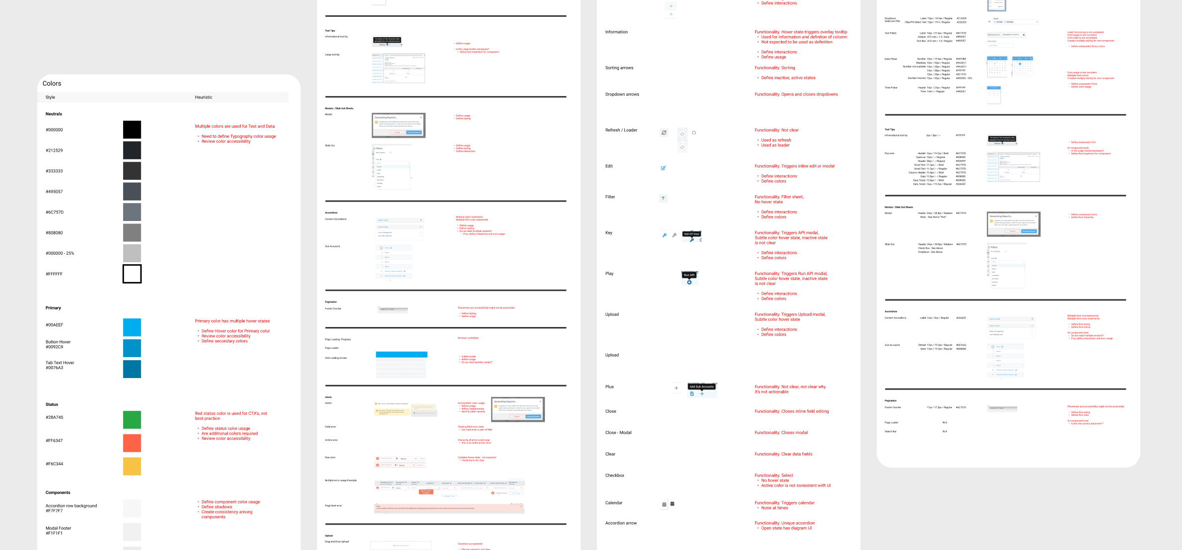
Audit
The comprehensive audit has discerned a notable opportunity for improvement across various dimensions, specifically in the realms of accessibility, scalability, and flexibility. Through a thorough examination, areas have been identified where enhancements can be implemented to elevate the overall performance and adaptability of the system.
Foundation
The system's success depended on aligning our teams on key brand elements. Lukka is structured to scale for each business book, requiring the inclusion of every UI element in our foundational system. This framework covered essential elements like logos, grids, spacing, typography, colors, and interactive language, guided by clear usage instructions.
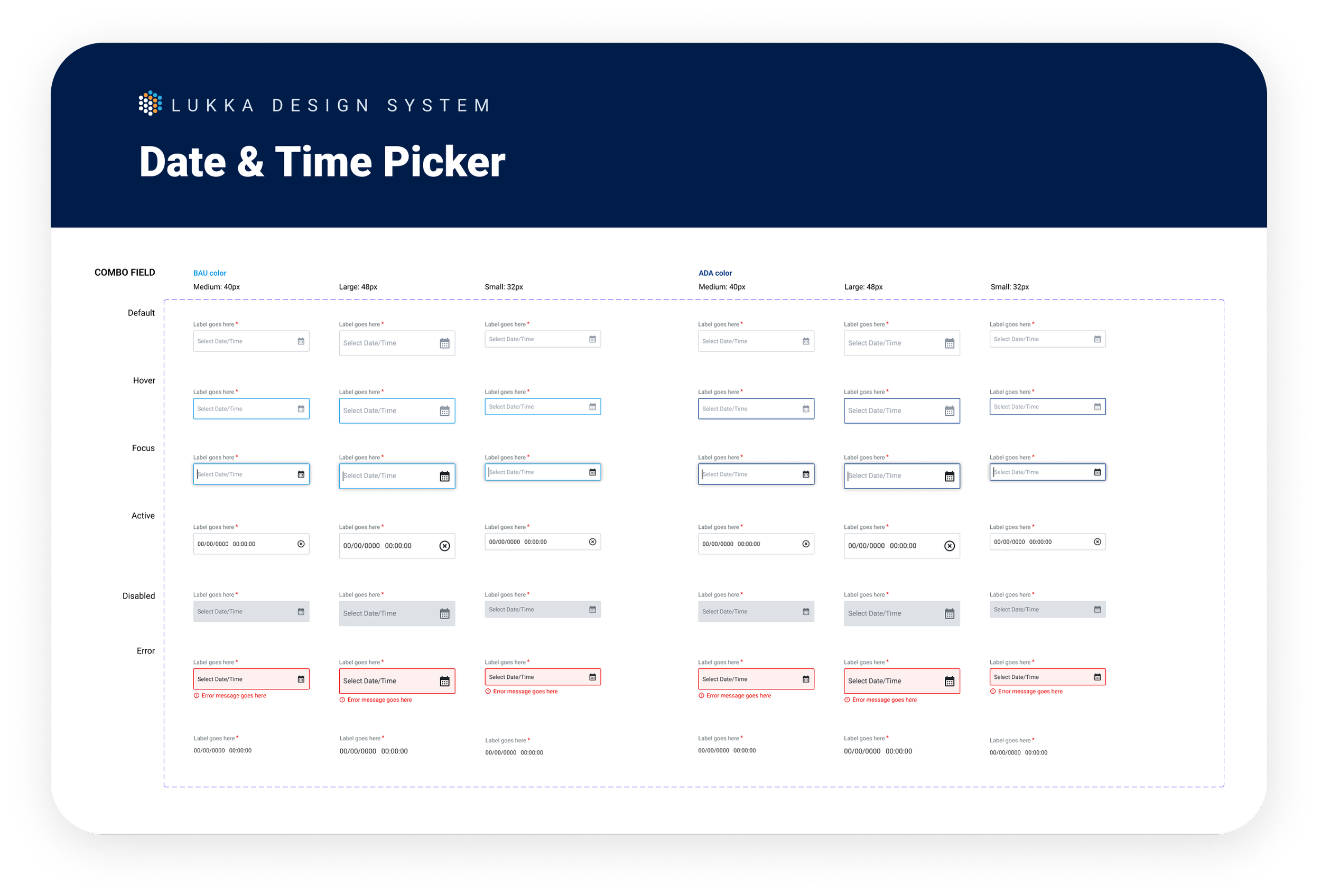
Consistency in design language across brands was upheld through the implementation of both light and dark mode variations for buttons, inputs, and interactions. This approach provided greater flexibility in placing elements on pages with diverse background options while ensuring optimal contrast. Additionally, it enabled components to evolve continuously, maturing alongside emerging technologies and features.
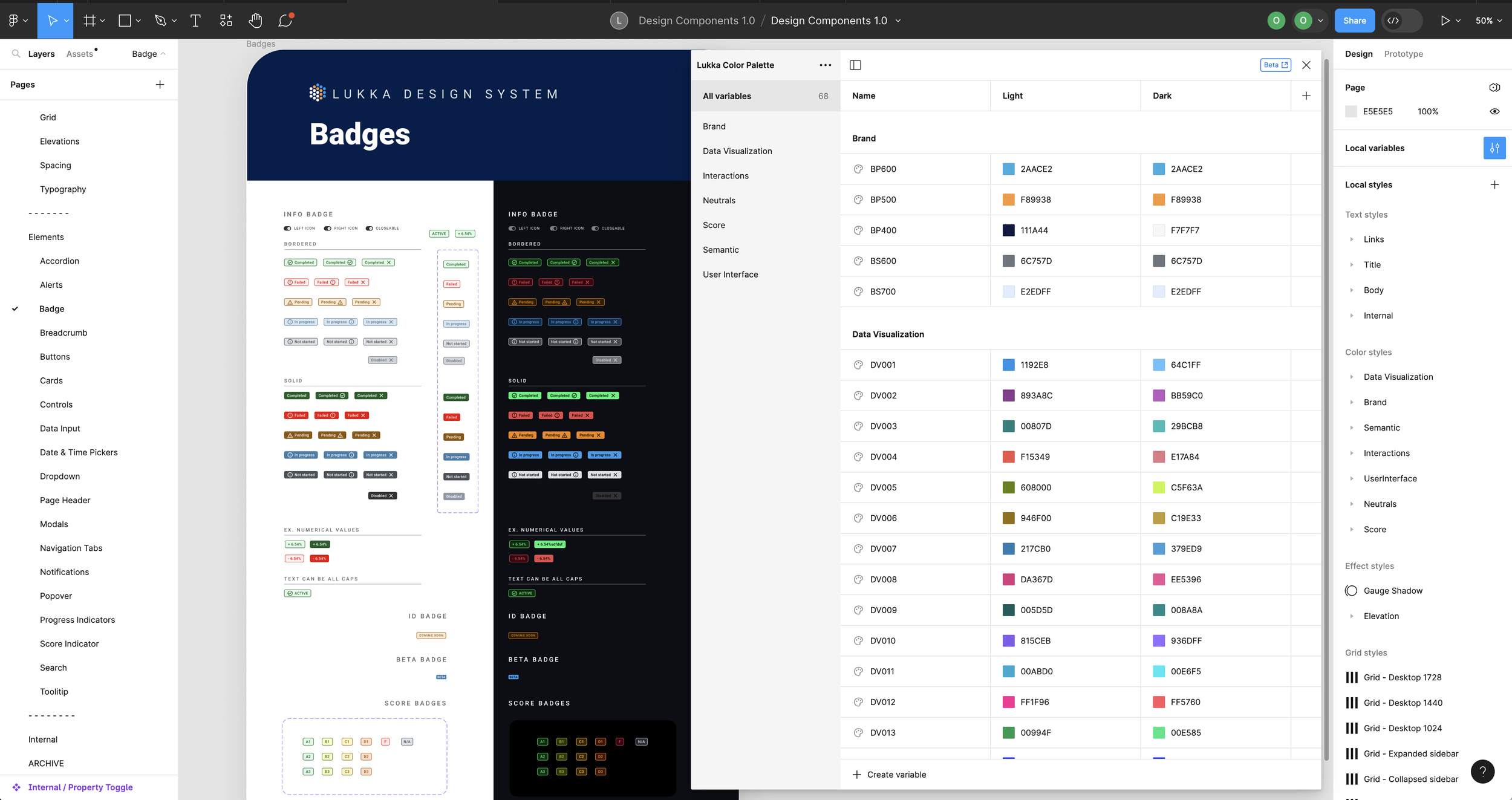
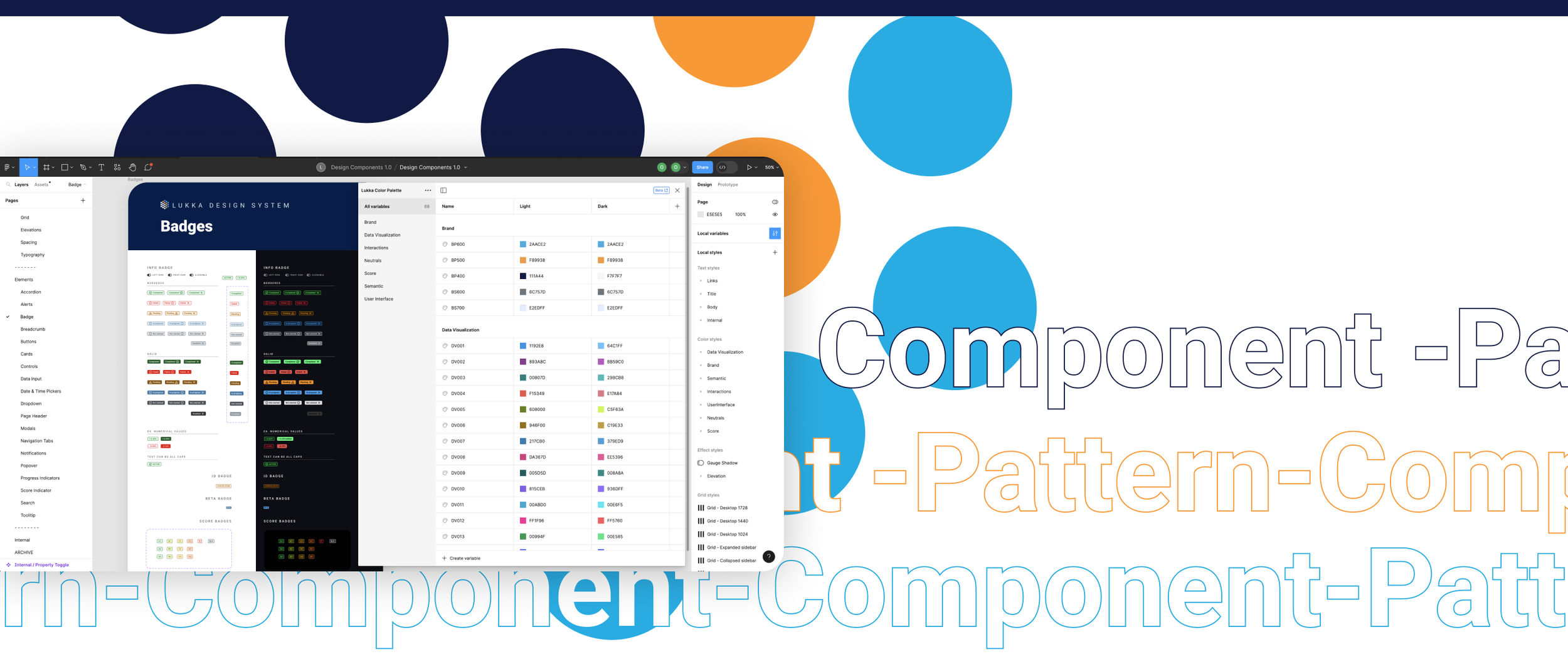
Components
Within the design system, various component types, including global, structural, content, data, and utility, are referenced. It was essential to clearly define the distinctions between these component classes to facilitate efficient and accurate design decisions based on the page context. Each component was equipped with stepped interaction examples to communicate expected interactive states effectively.
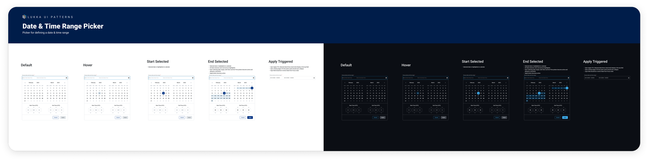
Patterns
Patterns are employed to demonstrate reusable combinations of components that cater to common user objectives through sequences and flows. These were crafted with our global market rollout strategy in mind. While not every conceivable pattern was created, this documentation forms the foundation for addressing our customers' most prevalent needs.
Implementation on Live Component Library
Upon completing the component library on the design side, the subsequent phase involved making it "live" and sharing it with all front-end engineers to ensure consistency throughout our product. The product design team collaborated closely with engineers to launch the live component library. Remarkably, within a mere six months, we successfully conceptualized, implemented, and released our inaugural design component library that is scalable.
Governance and Documentation
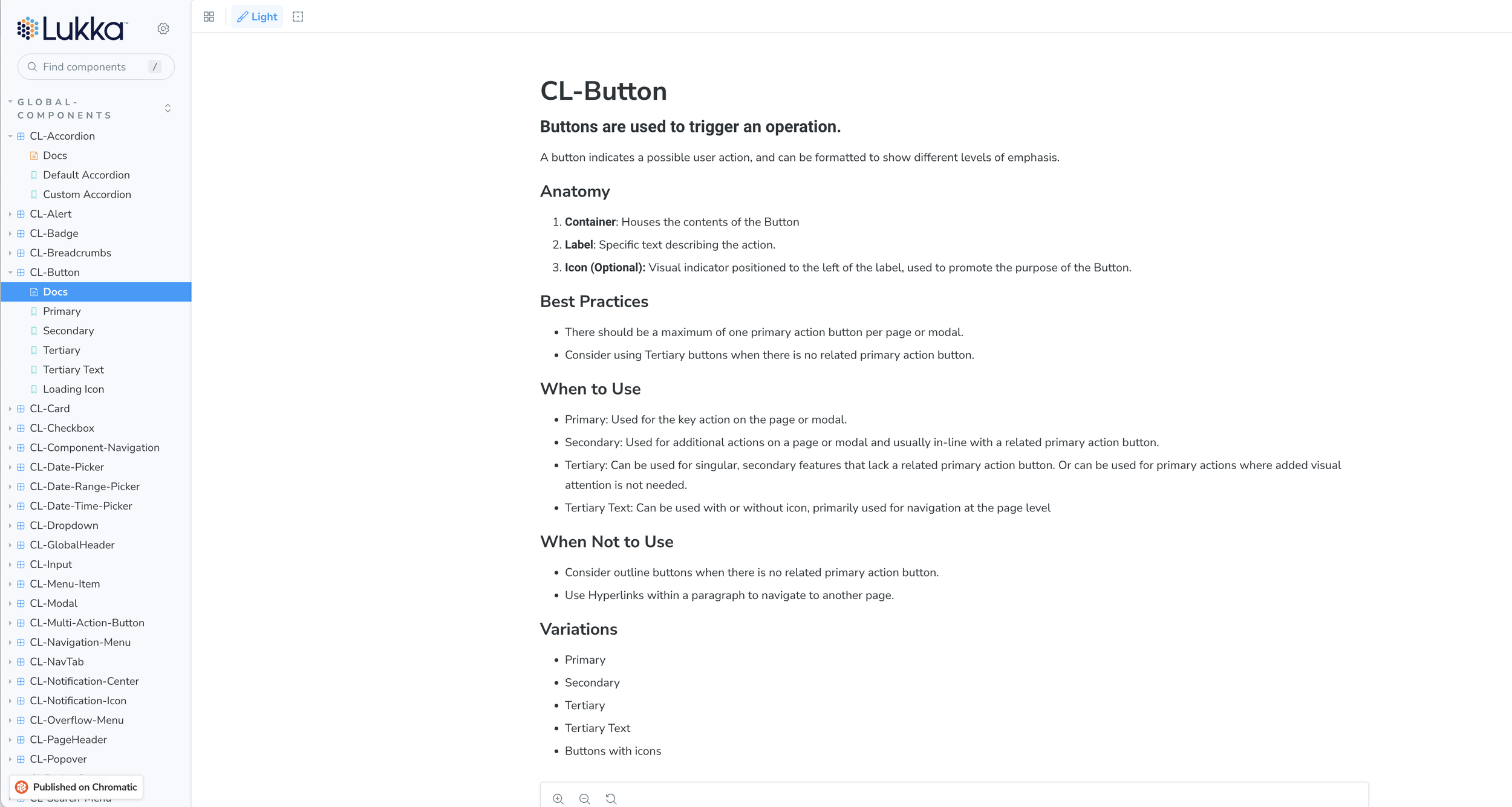
It is crucial to establish a standardized UI and articulate usage guidelines for our internal users. Achieving alignment and educating others empower designers to excel in a collaborative environment, leading to heightened productivity and focus. Our team has integrated usage guidelines, outlining how each component is established and effectively utilized in various contexts.
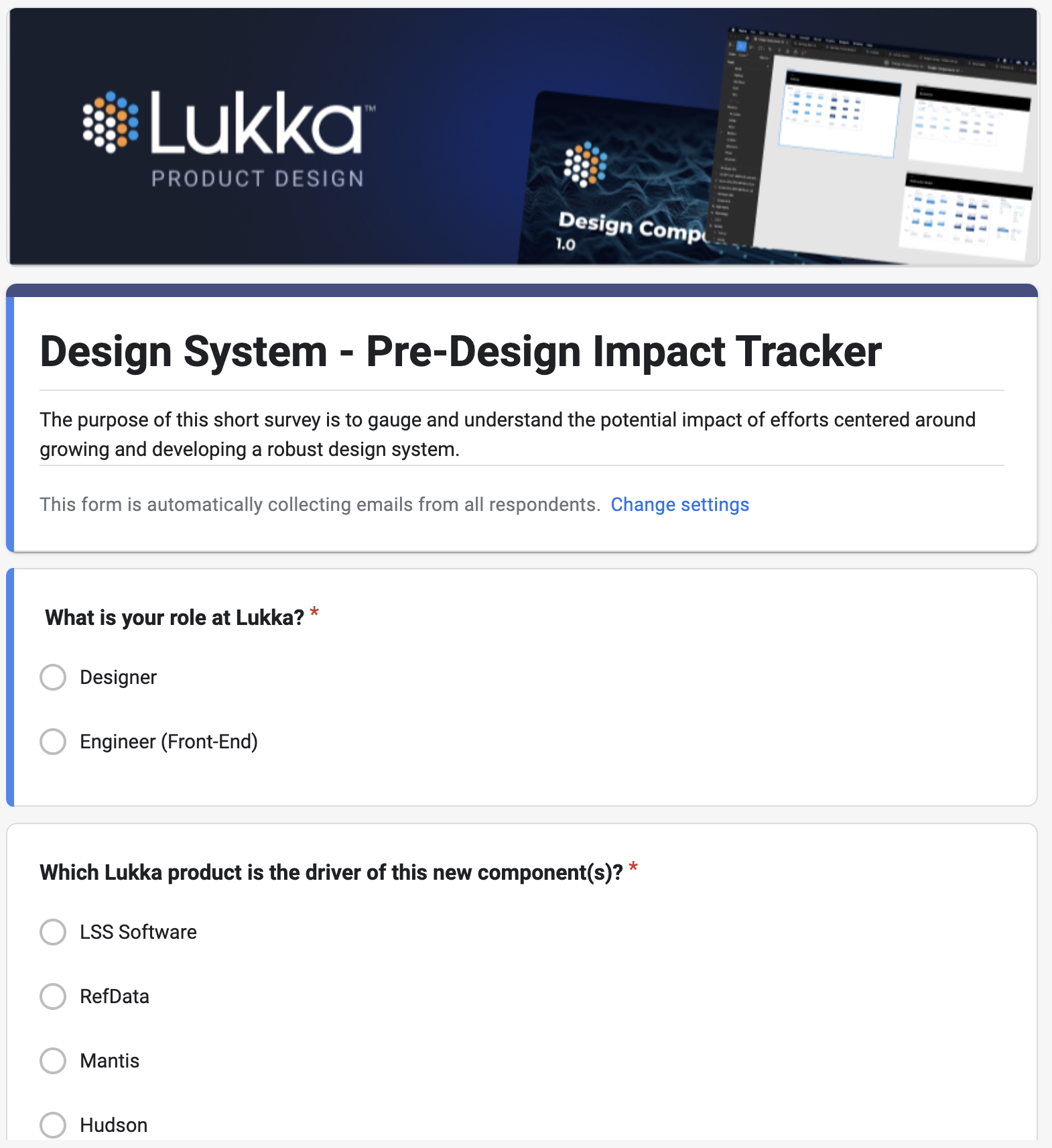
Impact
The impact of the design component library was evident within six months of designing to implementation. Testing on our internal reference data product revealed significant improvements.
According to the impact tracker survey sent out to both front-end engineering team and designers,
Front-end Engineering Impact
27%⬆︎
Productivity Increase
35%⬆︎
Development Efficiency Increase
33%⬆︎
Implementation Speed Increase
Design Impact
32%⬆︎
Productivity Increase
53%⬆︎
Design Efficiency
46%⬆︎
Design Deliverable Speed
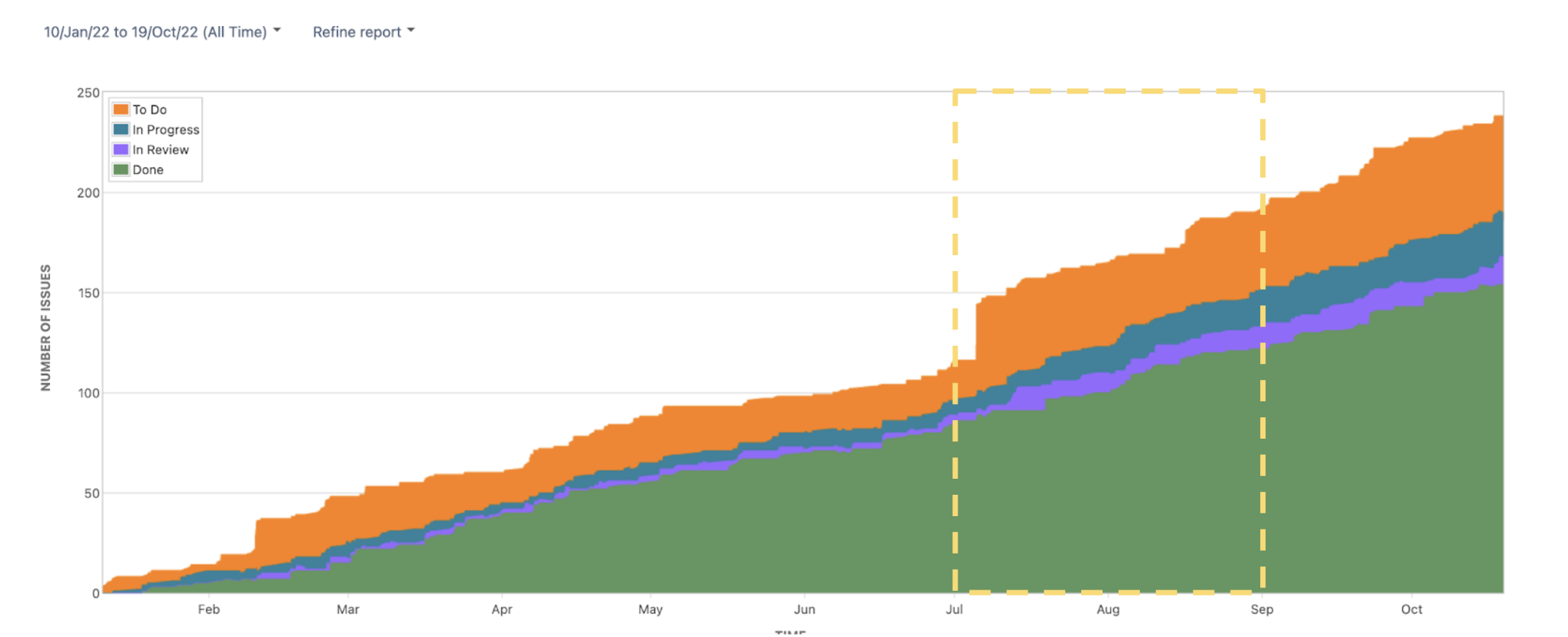
Survey Results:
85% of front-end engineers reported improved consistency in design implementation.
60% noted a reduction in the time required for design handoff to implementation.
This user research process highlighted the challenges faced by front-end engineers in different business units, leading to targeted improvements in design documentation and component standardization. The outcome showcased positive impacts on consistency and efficiency in design implementation.
What We Could Have Done Better
Reflecting on the journey, there's recognition of areas where support for the team as individuals could have been more robust, aligning more closely with business goals. As a product design lead, a continuous focus on individual growth and aligning design objectives with overarching business strategies is crucial for sustained success.
-
Despite positive feedback, there's room for improvement in user education and training. Investing in more comprehensive onboarding sessions and documentation could further enhance user proficiency and utilization.
-
The Design Component Library is not static; it requires ongoing refinement based on user feedback and evolving design needs. Establishing a structured plan for iterative enhancements will ensure its continued relevance and effectiveness
-
While success metrics showcase overall positive impacts, establishing specific metrics to measure the impact of iterative releases would provide more nuanced insights. This includes understanding how each enhancement contributes to design consistency, development efficiency, and user satisfaction.
Next Step and Future Consideration
Looking ahead, the next steps for the design component library involve rolling it out to external-facing software and iteratively expanding its capabilities. Identifying more use cases and opportunities for improvement will be pivotal. Moreover, recognizing the potential to extend the library to other devices is on the horizon, although the current use case primarily centers on desktop usage due to the nature of the business and the tasks our users aim to accomplish. This forward-looking approach ensures that the design component library remains adaptive and aligns with evolving user needs and technological advancements.
In conclusion, the release of the Design Component Library marks a significant achievement, positively impacting design consistency, development efficiency, and user satisfaction. Acknowledging successes while addressing areas for improvement will contribute to the ongoing success and evolution of this foundational design resource.
-
Consider extending the use of the Design Component Library to external-facing software. Evaluate the potential impact and adapt components to meet the needs of a broader audience
-
Explore opportunities to expand the Design Component Library to other devices. Assess the feasibility of adapting components for mobile or tablet experiences to cater to a more diverse user base
-
Foster a community around the Design Component Library, encouraging collaboration, and sharing best practices. This can lead to valuable insights, feature suggestions, and a more robust ecosystem
-
Maintain a strong focus on continuous education and communication. Regularly update documentation, conduct training sessions, and keep stakeholders informed about new releases and best practices
-
Strengthen feedback loops with end-users, designers, and developers. Establishing a more direct and frequent channel for feedback will ensure that the Design Component Library remains responsive to evolving needs.
More Works to Browse

Lukka Insights™
Folio
Pharma Agent App

Koinos
Now&Gen